

Today we will talk about contrast and how it relates to photography. We will also talk about the various types of contrast and how to use contrast in our photos.
Contrast is the degree of difference between the elements of a photograph. It might be the difference between light and dark in an image, the difference between colors, or even the difference between ideas. Contrast may not be the first thing you think of when taking a photo, but there’s no doubt that adjusting the contrast has a lot of impact on the final image. Here are the different types of contrast you can use to improve or change your image.
1. Tonal Contrast
Tonal contrast refers to the difference in brightness between the elements of the image. If the image has both very dark and very bright tones, it has a high tonal contrast. If the photo has a wide range of tones from pure white to pure black, it is considered a medium contrast image. If it has a range of middle tones, but lacks the pure whites and blacks, the photo is a low contrast image.
2. High Contrast
High-contrast photos have bright whites and dark blacks without a lot of medium tones. High-contrast photos are great for making your subject or element stand out in a photo, such as in silhouette photography or when shooting bright colors against a dreary dark sky.

3. Low Contrast
Low-contrast photos have very little tonal contrast, so instead of whites and blacks, you will see a lot of gray tones. Instead of details that pop, low-contrast photos have a dreamy feel without a lot of shadows or highlights. Low-contrast photography is great for moody landscapes, portraits, or when you want to feature a scene with soft, warm tones.
4. Colour Contrast
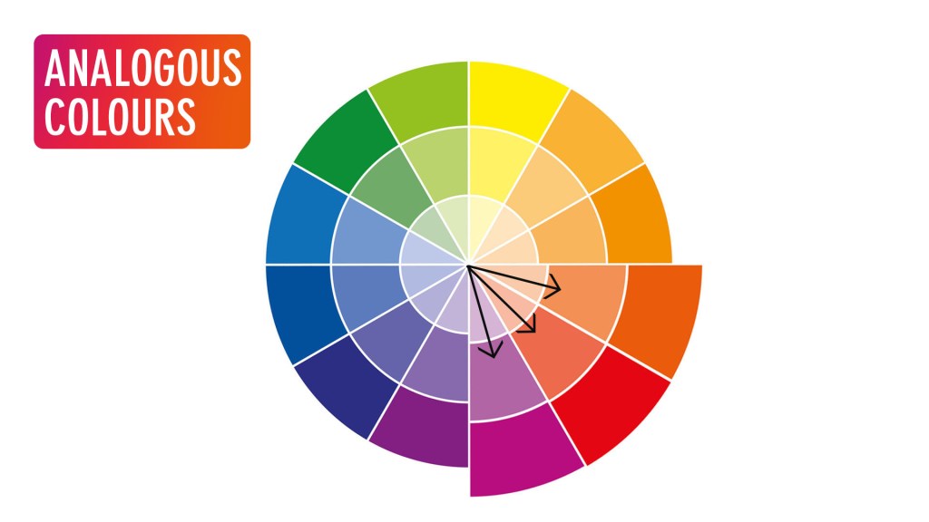
Colour contrast creates contrast in an image with varying degrees of contrasting colors. To understand colour contrast, let us have a look at the colour wheel. In the colour wheel, some colors are next to each other on the color wheel. They are called analogous colours and will result in less contrast. Colors opposite to each other, like blue and yellow, contrast strongly when placed together. These are called complementary colours.

5. Contrast Through Textures
You can combine rough with soft elements to give your image that extra punch. The background will appear blurry and soft in contrast to the sharpness and texture of your subject. If you have a soft element, it will pop out in a textured background.
Now that you know the basics of contrast photography, here are some tips and ideas for using contrast to create stunning images.
1. Single Colour Background
Still-life photos, flowers, macro shots, and even portraits can benefit if you use a single plain colour to act as a background. If your subject is dark, you may use a white background, or if it is light, you may use a black background. You can also use complementary colours to be the background.
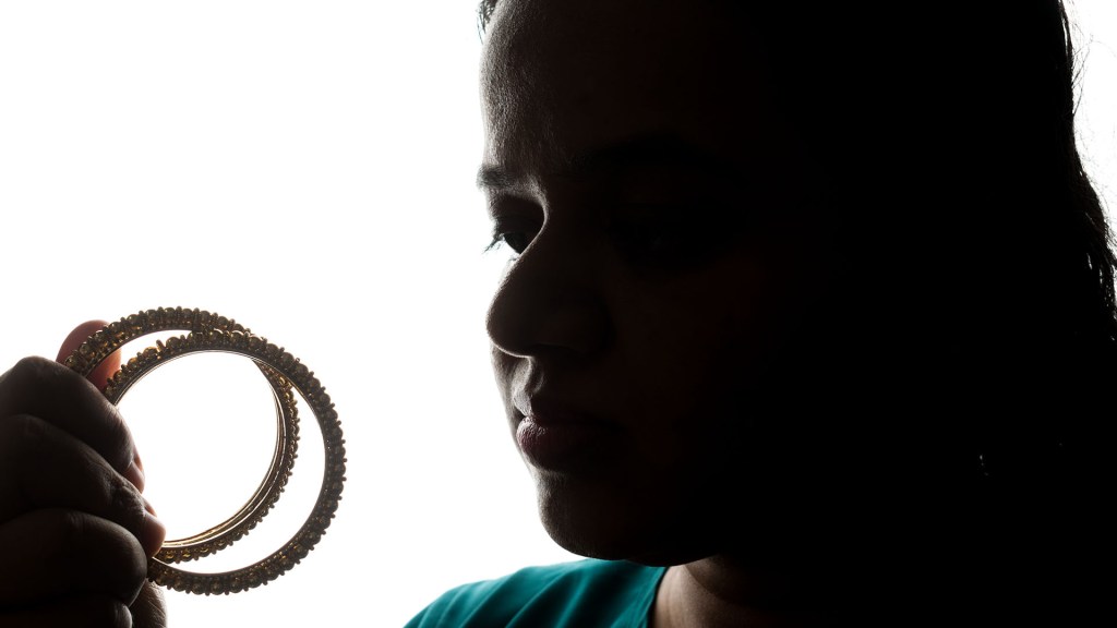
2. Shoot Silhouettes
Silhouette photos are classic examples of high-contrast photography. Because you are shooting against a bright background, your main subject will appear almost entirely black.
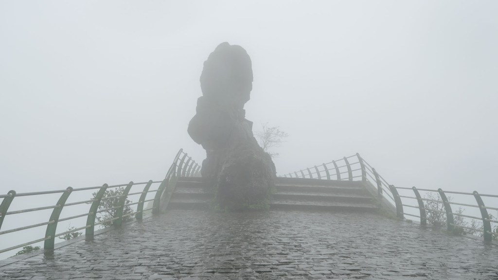
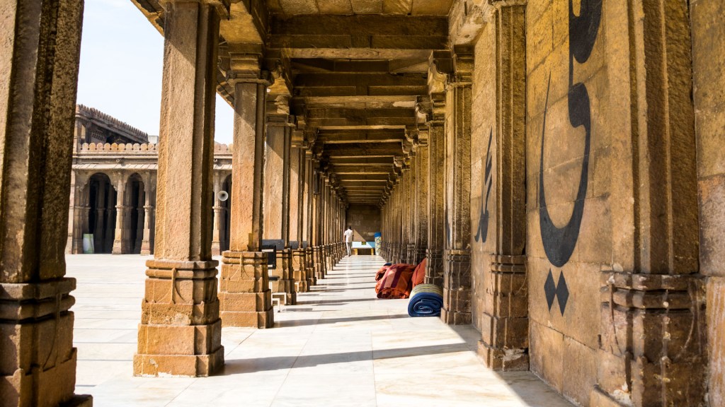
3. Look for Shadows
Where there is light, it will cast a shadow. If you head outside on a bright day, you’ll find yourself surrounded by interesting shadows. Crisp shadows can be found around distinctive architecture, on playgrounds, in gardens, and on city streets.
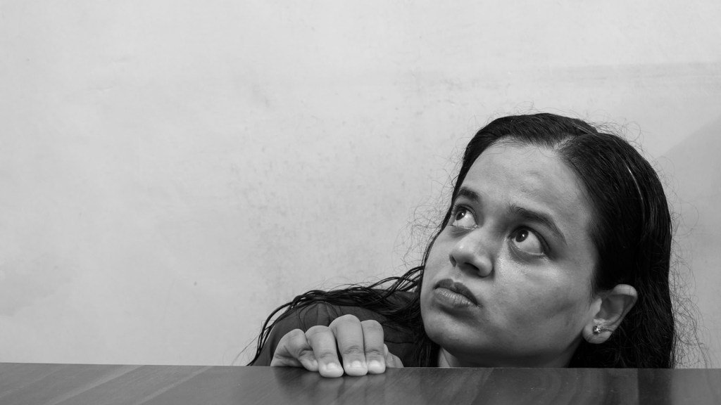
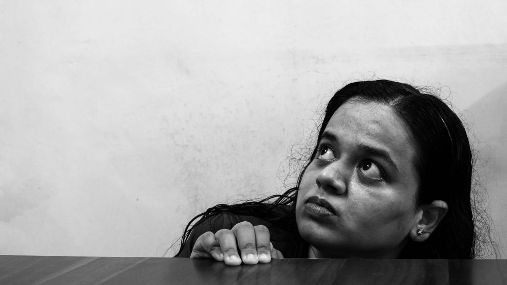
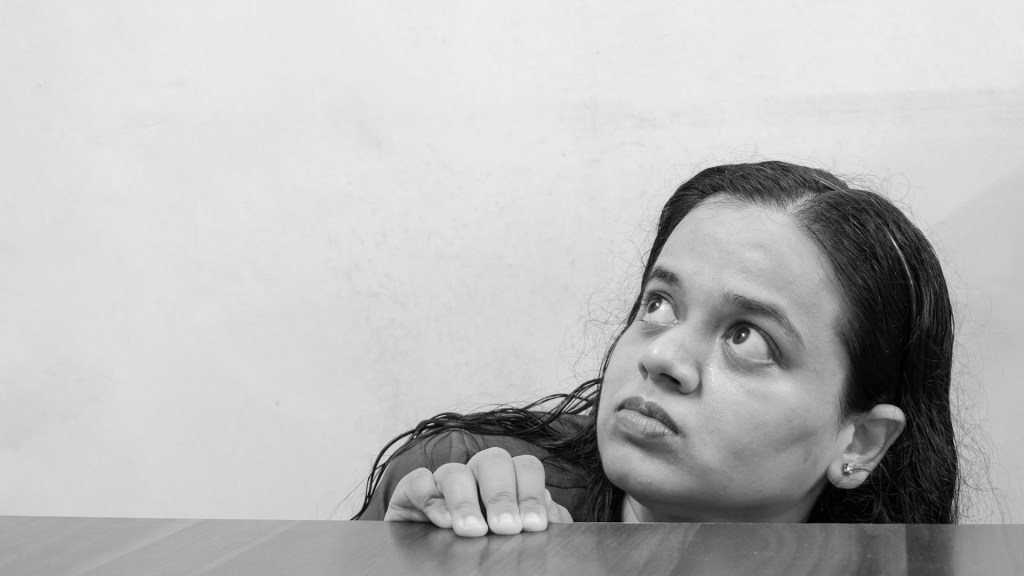
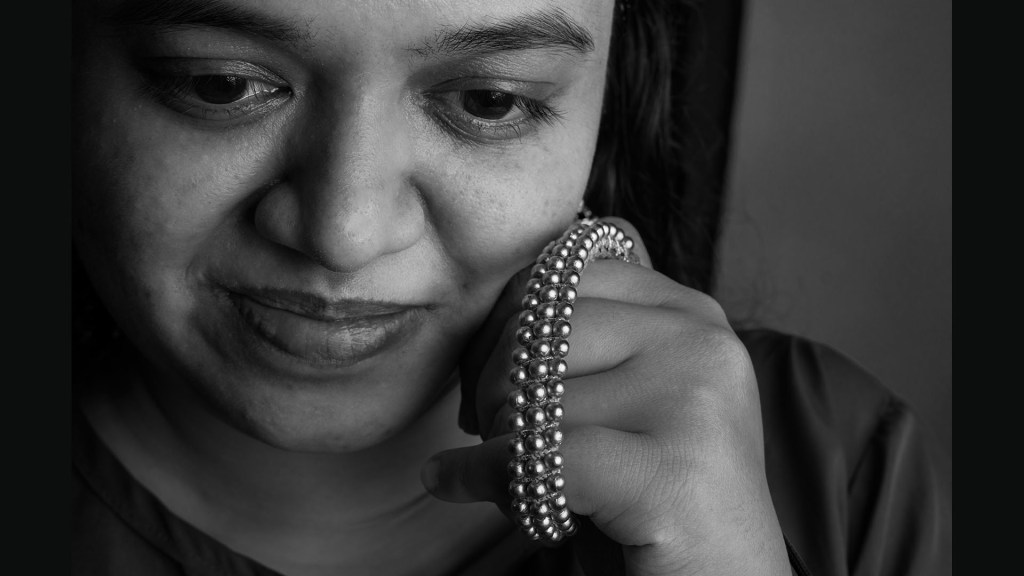
4. Go black and white
For tonal contrast, something that really helps is to set the camera to black and white or to convert your images into black and white in post production. Taking out the color helps you focus on light intensity and how it affects the image.
5. Post Production
You can also adjust the contrast of the whole photo by using the Contrast slide in post production. You get it in almost every software and app available. You can add contrast by sliding it to the right. To the left, you can decrease the contrast of the image.
As photographers, contrast is a crucial element to consider in all our shots. It helps us to convey a mood or a message to the viewer. Tonal contrast is the best-known, but there are other types such as colour and texture contrasts. Which I hope I explained to you thoroughly…
I hope you liked my blog. Do let me know your suggestions and thoughts in the comments section. Thank you!
Also Read – Left to Right Rule in Photography
CONNECT WITH ME:
YouTube: https://www.youtube.com/user/agarwalsonika7
Instagram: https://www.instagram.com/agarwalsonika/
Twitter: https://www.twitter.com/agarwalsonika7/
Facebook: https://www.facebook.com/sonikatravels

2 thoughts on “Use Contrast in Photography (5 Types of Contrast and How to Use in Photography)”