

Let’s talk about the colour theory today. In photography, colour and light go hand in hand. Colours are the light wavelengths that the human eye receives and processes from a reflected source. Once you have mastered the colour theory, looking through a camera lens is a new and rewarding experience. Let us start with the colour wheel and how colours interact with each other.
Colour Wheel
The colour wheel consists of 12 colours: 3 primary, 3 secondary, and 6 tertiary colours. The three primary colours are red, blue, and yellow. Secondary colours made are made when the primary colours are mixed: Green, purple, and orange. Blue + Yellow = Green. Red + Blue = Purple. Red + Yellow = Orange. Tertiary colours are the secondary and primary colours mixed.
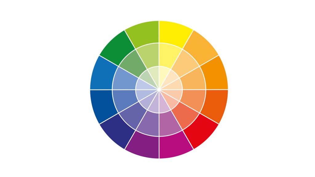
If you split the colour wheel in the middle from top to bottom, you will separate the warm colours from the cool colours.

Now we will see how combining these colours can create various colour schemes or harmonies.
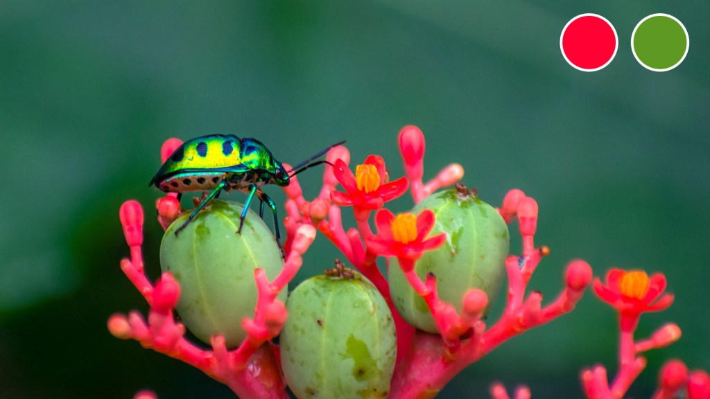
Complementary colours
Complementary colours are two colours opposite to each other on the colour wheel. For example, red and green, or blue and orange. When combined, these two colours provide contrast and a pop of colour. They work well together, meaning they can create a high-contrast and vibrant look, especially when used at full saturation.

Analogous colours
Analogous colours are three colours that are side by side on the colour wheel. They are composed of one dominant colour, a supporting colour, and a third colour that is either a mix of the two first colours or an accent colour that pops. A great place to try analogous colour schemes in photography is landscape and nature photography. Unlike complementary, analogous creates a smoothing look in which one colour dominates, one colour supports, and the other colour accents.


Monochromatic colours
Monochromatic is different tints, shades, and tones of a single colour. For example, adding white to red makes pink. Adding black to red creates maroon. This creates a monochromatic colour scheme of pink, red, and maroon. When visual distraction is removed, there’s a greater degree of concentration on composition or texture.

Triadic Colours
Triadic colours are colours evenly spaced throughout the colour wheel. These tend to capture vivid colours and stories. It can emphasize lots of motion, strong features and can fill the space edge to edge.


Split Complementary Colours
By taking two colours that lie directly adjacent to one of the colours in a complementary colour harmony, you get a split complementary harmony. The result is a striking and harmonious photo with a little bit less of the dramatic tension we’re used to seeing in photos with complementary colours.


Although the colour wheel is a great tool to judge the harmonies of the colours in our scene, it is not a compulsory guideline to be followed. For instance, pink and blue are a fantastic colour combination, but they are not complementary to each other, nor do they lie particularly close to each other on the colour wheel. The best tool in this case is just your own eye. Now we come to the three basic components, or variables, of colour – hue, value, and saturation.
Hue
Hue is used to describe a colour in its natural state. It corresponds to its position in the colour spectrum. Let’s take the colours of the rainbow. Red, orange, yellow are categorized into warm colours and green, blue, indigo, violet are called cool colors.

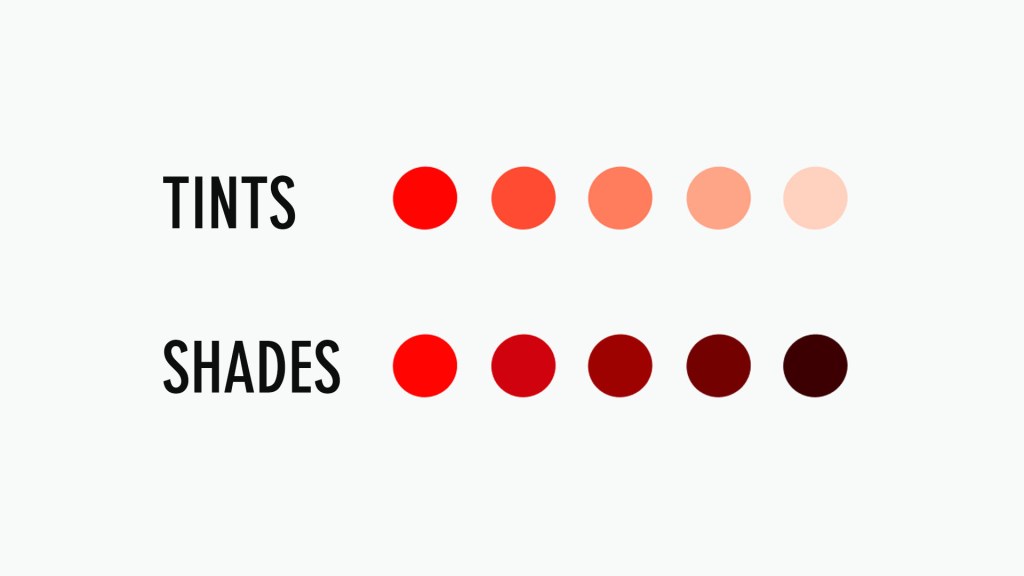
Value
Value is the relative lightness or darkness of a colour. This is what’s seen in a black-and-white photograph. Adding white to a colour makes it lighter, which creates “tints”. Adding black makes colours darker and creates what’s called “shades”.
Saturation
Saturation highlights the brilliance and intensity of a colour. The saturation of a colour is its degree of richness, intensity, or purity. A hue will be the most vivid at 100% saturation. The intensity of a hue is decreased by adding gray or a complementary colour.

Colour Psychology
There are emotions and feelings associated with certain types of colours. Warm colours like red, orange, and yellow tend to evoke feelings of warmth, energy, and action. On the other hand, cool colours can evoke calm, peaceful, or serenity-like feelings. Colour psychology has had a huge impact on marketing and advertisers use this to their advantage when creating ads to appeal to customers’ emotions.
Storytelling
After you have a good understanding of colour schemes and the colour wheel, knowing good subject placement and framing can really help tell a story. No matter whether you’re capturing still life, portraits, or landscapes, knowing where to place certain colours in your images will give you more emphasis on what you’re trying to illustrate. For example, choosing more monochromatic colours in a still life photo might convey a classic, clean style, or choosing an analogous colour as a seamless background to emphasize the product and branding.

Colour is powerful. Developing a good eye for colour takes time and practice.
I hope you liked my blog. Do let me know your suggestions and thoughts in the comments section. Thank you!
Also Read – Leading Lines in Photography
CONNECT WITH ME:
YouTube: https://www.youtube.com/user/agarwalsonika7
Instagram: https://www.instagram.com/agarwalsonika/
Twitter: https://www.twitter.com/agarwalsonika7/
Facebook: https://www.facebook.com/sonikatravels

3 thoughts on “Colour Theory in Photography (Depth in Photography Composition)”