

Nature is the original artist—every flower, insect, and leaf are part of its colour story. Today, let’s explore how to use colour harmony to make your nature photography more impactful.
As photographers, we often chase sharpness and detail. But what really makes a photo stand out—what makes someone stop scrolling—is the colour. Today, we’re diving into the world of colour harmony—how to find it, how to frame it, and how to use it to tell better visual stories right here in nature.
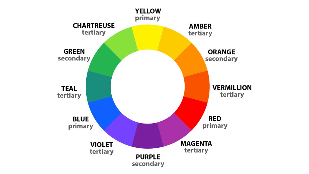
1. Learn the Basics of Colour Theory
Start by understanding primary, secondary, and tertiary colours. Know what complementary (opposite) and analogous (next to each other) colours are. This will help you recognizenaturalcombinations when you’re out in the field.
2. Use Analogous Colours for Calm and Unity
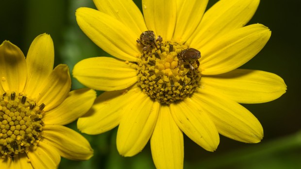
Look for scenes where colours sit side by side on the colour wheel—like green leaves, yellow butterflies, and orange flowers. These combinations feel harmonious and peaceful, great for a soothing nature shot.
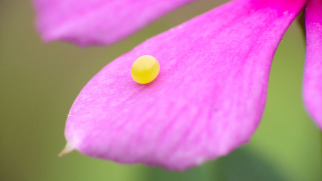
3. Try Complementary Colours for Drama
Spotted a blue butterfly on a warm orange lantana? That’s a natural complementary pairing. These opposite colours create tension and energy in the frame—perfect for powerful compositions.
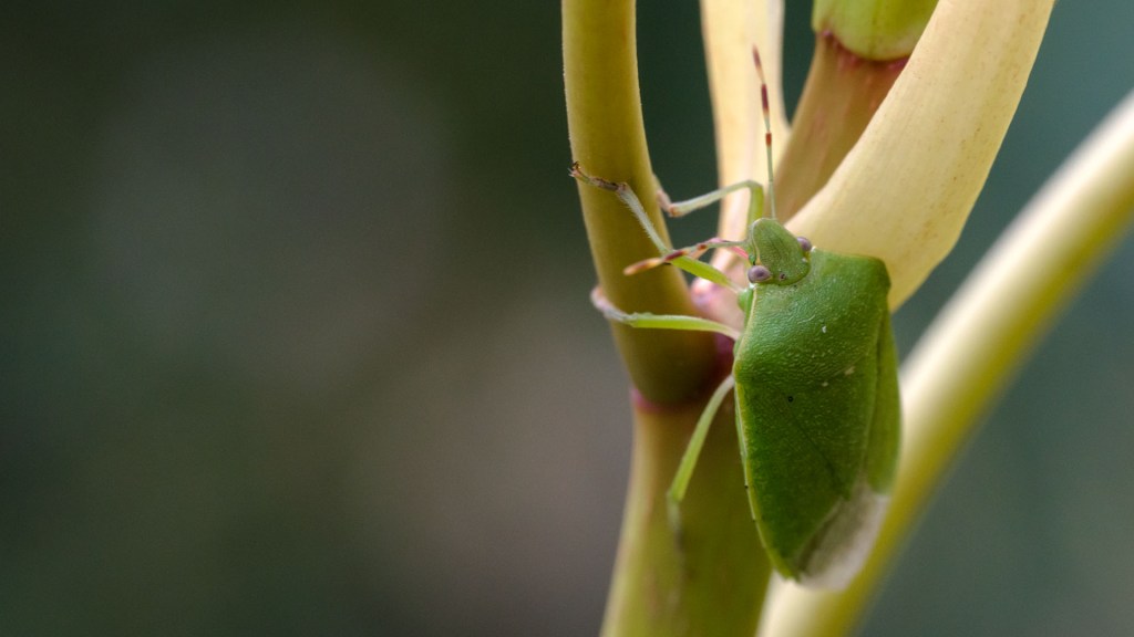
4. Find Monochrome in Nature
Look for single-color stories with subtle variations—like different shades of green. A butterfly that blends into that colour range creates a beautifully unified composition.

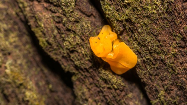
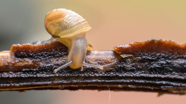
5. Use Neutral Colours as a Canvas
Browns, greys, and soft whites can help bright subjects pop. Think of a vibrant red insect on a sandy background—it becomes the hero of the frame. Let the neutrals do the supporting work.
6. Take Advantage of Natural Light
The time of day changes colour temperature—golden hour adds warm tones, while cloudy light makes colours more even and soft. Know when to shoot for the colour mood you want to create.

7. Observe Colour Repetition
Repeated colour elements in your composition—like multiple flowers or insects with similar colours—create rhythm. It leads the viewer’s eye across the frame, like a melody made visual.
8. Contrast Saturation and Texture
Use a brightly saturated subject against a soft, textured background for emphasis. For example, a shiny insect wing over fuzzy green moss. The visual contrast enhances interest.

9. Pay Attention to Background Colour
In macro photography, the background is everything. Use distance and depth of field to ensure your background either complements or contrasts your subject. Avoid colours that clash or distract.
10. Let Nature Guide the Palette
Don’t force colour harmony—let it reveal itself. Sometimes, the best photos come from simply being attentive to your surroundings. Let the natural environment show you what works.

So next time you’re out with your camera—don’t just look for the subject, look for the colour story too. Until next time, keep chasing light and colour!
Also Read – Bokeh Photography Tips
CONNECT WITH ME:
YouTube: https://www.youtube.com/user/agarwalsonika7
Instagram: https://www.instagram.com/agarwalsonika/
Twitter: https://www.twitter.com/agarwalsonika7/
Facebook: https://www.facebook.com/sonikatravels/
